Debbie MacDonald Moynes’ comments on the unveiling of Community Care’s new logo
In 1981, the logo for Prince Edward Community Care was a blue circle with the words “Community Care” in white lettering. Thinking there was a need for something more recognizable for a logo I traced the outline of Prince Edward County and put the words “Community Care” inside that. When we developed a website many years ago, the designer put the blue shading around the south east shorelines. Not much thought went into a logo that would be used for 25 years.
Fast forward to 2006 when things are changing, expectations are different, and promotional materials, even for a not-for-profit agency, should look much more professional. The board decided that we would turn to the Prince Edward Lennox & Addington Community Futures Development Corporation for support to update our look as an organization. We submitted a proposal that was approved and we hired Floating Point Communications.
We are so pleased and excited to unveil tonight, on the occasion of the 30th anniversary of the agency, the new logo for The Prince Edward County Community Care for Seniors Association.
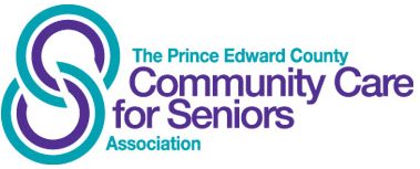
This design has a contemporary style in the sense the it is clean and made of simple shapes. The thinking behind it however, is not as simple. The logo is made out of a combination of C’s. The C’s are linked and positioned in a very deliberate way. Each double C group represents Community Care. They have been carefully positioned to form an S, which stands for seniors. The way the C’s and S’s have been combined is intended to symbolize the caring connection between the community and seniors.
The colour of the outer C is the same as the name ‘Prince Edward County’ and the word ‘Association’. And likewise the inner C is the same colour as the name…’Community Care for Seniors’. This is intended to symbolize the relationship between the organization and the seniors that are supported by our progams … a relationship which is close, caring, and dignified.
I’d like to introduce the graphic designer, James Ryan as well as Clair Kimmett. They are with Floating Point Communications, the local consulting firm that we hired to help with this project. When James and Clair attended the board of directors meeting, armed with several different logos, this was the logo and colour combination that the board and staff members almost immediately were drawn to.
In the coming months and years you will see this logo on all of Community Care’s marketing and promotional material. The design might come to mean something important and recognizable to you, we hope that it does. We believe that some of you will find the slight tilt to the right to signify motion, something that our organization has always been doing…moving ahead.
The C’s and S’s are shown in the logo, and they are linked together, like the links of a chain. That’s how we see Community Care, links in the chain that is the continuum of care for people who need support to live at home. And even more than that, the agency is linked to the very fabric of this community. Look at the number and diversity of people in this room for our anniversary event. We have funders here, along with volunteers that drive people to medical appointments, deliver Meals on Wheels and visit elderly people in their home. We’re linked to the other Community Support Service agencies that support people in the community; to the primary care practitioners; the hospital; the many groups and organizations that support our work; to our members and donors; and we’re linked to the many volunteers and other supporters.
Each and every day our agency seeks to address our mission statement – to assist older adults to live in a home environment in reasonable independence. We embrace our vision – the freedom and dignity of choice; the comfort of home; a passion for volunteers. Prince Edward County is a wonderful place to live, to work and to grow old. The strong sense of community here in The County, is, in part, why Prince Edward Community Care has had a very successful first 30 years! Thank you.

